
Redesigning how Credit Analyst access and analyse their financing’s data
Role
UX Designer
Company
Qazwa.id
Platform
Website
Timeframe
1 Month
Overview
Qazwa is platform P2P Lending Syariah. Credit analyst admin uses its dashboard to verify incoming financing on the Qazwa platform.
Problem
The credit analyst dashboard is a feature that is frequently seen by credit analyst admin's as it is the first page one would land upon when they login.
But what happens as soon as the financing has launched or concluded? How can we help financing organizers track their success and optimize for their next financing?
Talking to The Team
In order to understand this persona a bit more, we spoke to our own credit analyst admin team's. By doing this, we could also capture how they were using current the dashboard and what value they took from it. We learned that admin verifies a lot of recurring financing based on financing category and risk level.
Some of their major pain points came from the missed focus of the dashboard. For example, When a financing comes in for verification, the admin doesn't know the total of the previous financing that is still not paid off.
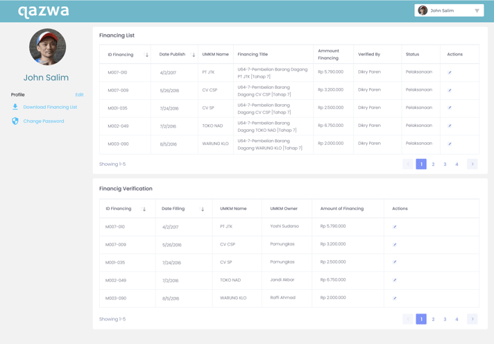
What Qazwa financing analyst dashboard used to look like
I noticed the dashboard also lacked global-level data for all of an organizer’s financing and that there were functionalities that didn’t quite belong. Visually, there was also a lack of hierarchy and priority in the way information was presented.
We also looked at other dashboards of popular platforms to further my research on what a useful dashboard is comprised of.
Some takeaways of what made them successful included:
- Well structured navigation
- Data presented in filterable timelines
- Insights shown at different milestones
Goals
Connected the problem space, so we can get ;
User (Credit Analyst Admin):
Improve in order to relieve pain points that Admin Credit Analyst encounter, especially around their journey of when a financing goes on market or to preparing for their next financing campaign.
Business:
Increase engagement and retention of credit analyst admin of their dashboard.
Product:
make display the data in a more visual way for it to be better digested and appealing.
Redesign Process
To start the project with a clear understanding, we arrange starting with Question, we created a list of ‘How Might We…’ questions to help us better align our user’s tasks and goals:
1. How might we provide an experience that is engaging and valuable to our users which mean is credit analyst admin ?
2. How might we provide a tailored experience that allows organizers to see what’s most important to them?
Card Sorting
We ran a card sorting session that was composed of members from our Credit Analyst teams. We used this technique to determine which functionalities of the dashboard should stay, be relocated or be eliminated based on our platform’s information architecture and how much value it was adding on the dashboard.
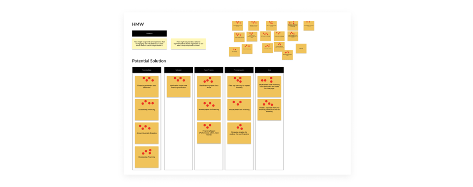
Iterate Iterate Iterate
Based on our all of our findings shown above, we narrowed our focus into 4 areas for potential improvement of our original dashboard:
1. Improve the data we provide
2. Improve navigation
3. Improve notification
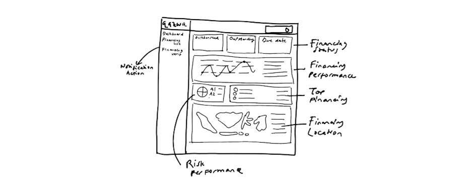
Improve the data we provide
know that most of our admins want more details on how much they verify financing each day, where is the verified financing location located, the amount of incoming financing with verified financing for comparison. I want to present the data in a more visual way to make it easier to digest and interesting. Given the technical constraints, I made sure we used charts and graphs from existing libraries
Improve navigation
We've included a sidebar of quick links that organizers frequent, and and separate financing data according to its function such as financing data to be verified
Improve notification
How can we tell our admin, how much is the total verification of financing so far? How much financing is outstanding today? How much financing is due more than 90 days? We're working to improve communications that will notify our admins of activity achievements to verify their financing.
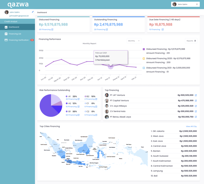
Version 1: In-web Qazwa financing analyst dashboard used to look like
Get the feedback
In this phase, I constantly collaborate with PM and dev to make sure the feasibility of the concept, considering we have several limitations.
Challenges and Compromises
Unfortunately, one of our main challenges is the lack of resources and time that we have day to day, as like most startups, we’re stretched quite thin! With this challenge, we often have to reiterate our designs in order to be achievable within time and technical constraints, while still providing more value to our users.
- In one version, I wanted to include a map of where an event’s top financing verified were located. Instead of developing a map, I scoped it down to showing a list of where these financing verified were from.
Final Design
After making sure all the technical feasibilities especially from our challenge, we decided to finalize the flow and the design. We ensure that the design is in line with the goal of users and the business. Here is the final of the dashboard feature:
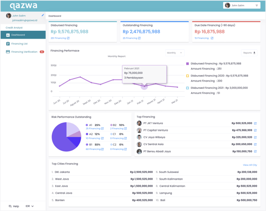
The latest iteration of the dashboard
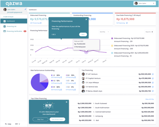
Onboarding the new dashboard using tooltips babystep
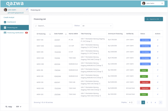
Financing table on financing list menu
Results and Takeaways
Results
The feedback we received from Credit Analyst Team was very positive, by providing the data and descriptions needed by the credit analyst admin, they could find out the milestone of the financing they verified.
“We can develop a clearer plan to verify the future financing- Arman J (Credit Analyst Admin)“
Beyond a boost in positive sentiment, we’ve also seen an increase in retention and engagement from admin as a direct result of rolling out this dashboard.
Takeaways
The most important part with design challenges like this is to iterate, iterate, and iterate. However, there are still improvements that can be made. A financing organizer should be able to filter their data even more, and customize the view based on their needs.